
The Label
With the new harvest batch, it felt like a good time to provide you with an explanation about the label design. The label is packed with Croatian themed iconography to reinforce the brand’s providence as much as possible.
My name is Parker and I am a transportation and product designer from Canada. I have been working alongside the Selo team since its inception, providing branding consultation. Working closely with Selo, the label has gone through several updates and changes as the company matures
The following is a breakdown of the label’s main themes:

1. The three ribbon interlace or “troplet” was an essential component of this Croatian-themed label. The troplet is an important motif in Croatian culture and dates back to the 9th century. The interlace can be found everywhere, from churches to military decoration.

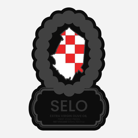
2. The administrative region of Biograd, or Biograd Na Maru, is outlined in the centre of the label to indicate where Selo Oils originates from. This seaside town is the historic capital of the medieval Kingdom of Croatia.

3.1. One of the most recognizable Croatian motifs is the red and white chequy. Used in the national coat of arms, this checkerboard originates from an apocryphal tale about the king of Croatia, Stephen Držislav, who ruled between 969–997 AD.
3.2. After Croat-Venetian relations deteriorated over tax protests, Stephen was captured by Doge Pietro II's army. It is said he was granted freedom after a high stakes chess game against the Doge himself, promoting the immediate use of a chequy in the kingdom's coat of arms.
3.3. Chequys at the time were also popular with Germo-Austrian emperors and thus may have been the result of historical or regional overlap.
4. Most commonly known as a symbol for peace, the olive branch in this application is used as a reference to the product’s contents.

5. The brand we have come to know and love, "SELO" translates into english as a word for "village". Selo Oils is proud of its raw, agrarian oil production techniques and the name is meant to conjure up images of hard work and communal celebration.

6. One of the original SELO branding designs, the SELO OLIVE logo subtly and intentionally includes an olive within the second O.

As the brand continues to grow, Selo will always strive to provide its clientele with the highest quality product possible. It has been fantastic to work directly with this brand as it penetrates and conquers the EVOO market.

Parker is an industrial designer. He received his Bachelors of Industrial Design from Carleton University in 2018.